Image By : Pixabay
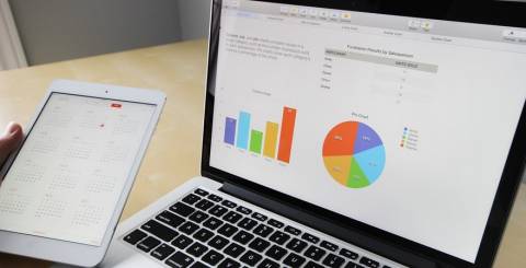
Big Data puts large amounts of information into the hands of business owners and managers who often can neither quickly process it nor analyze it. As a result, companies often fail to capitalize on valuable insights that could facilitate decision-making and deliver competitive advantages.
Rather than leaving such important resources on the table, companies are embracing data visualization tools that help them put Big Data to practical use. Because people can learn better through what they see, the graphical formatting of data gives companies a way to understand and react to the information they have.
Many software developers have created applications that empower decision makers with fantastic insights that can identify problems and opportunities. Here are six data visualization tools that can help you make sure that Big Data works for you.
Informer
Complicated visualization tools can relegate the compilation and analysis of data to technology-savvy individuals, excluding other members of your team. Entrinsik’s Informer supplies your firm with self-service business intelligence tools so that everyone in your company can use them.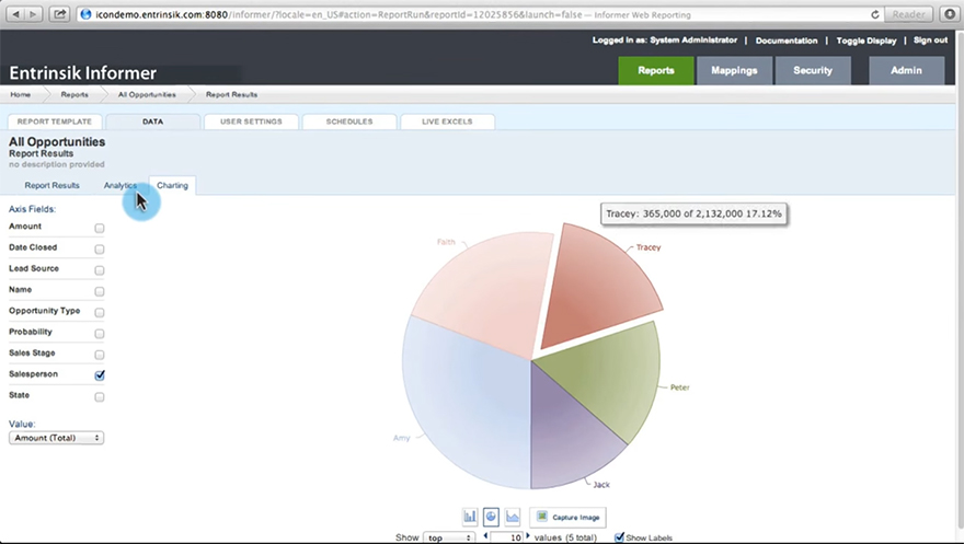
Informer uses a web-based drag-and-drop interface to make managing data sources easy. Similarly, graphic reporting is done visually, complete with filters. As a result, a few clicks of a mouse can supply you with multi-dimensional analysis, pivoting and drill down functions.
Official pricing for Informer is not publicly available, but you can get a quote for your company by contacting Entrinsik through their website. A free 30-day trial is available, so you have a chance to see what the software can do for you before you make a commitment.
iDashboards
Free your decision makers from complicated spreadsheets and traditional databases by giving them iDashboards. The ability to create custom dashboards gives your company the capacity to keep an eye on vital trends and quickly act to resolve problems and capitalize on opportunities.
Clicking on dashboard elements gives expanded pictures of represented data and the opportunity to drill into its finer details. Automatic synchronization tools in iDashboards ensure that your dashboards and reports always include all available information.
You can choose between the on-premises and cloud-based versions of iDashboards when you sign up for a free trial of the software. As a starting point, you can get a free limited personal edition.
Looker
Looker supplies your organization with SQL modeling that gives your team unlimited options for creating meaningful graphics from your combined data sources, without sacrificing self-service options. The application also uses Git for version control, so multiple people can work together on the same projects.
Although the emphasis on SQL commands can slow its implementation, Looker’s collaboration tools offer a compelling reason to try the software. Looker works through a web browser, so your mobile and remote workers can contribute to the effort to make Big Data work for you.
Power BI
Microsoft offers Power BI, a business intelligence tool that can help you make sense of BigData. Both a Windows and cloud-based version are available, although you have access to fewer features through the cloud.
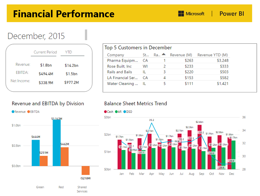
You can use PowerBI to access more than forty data sources, including those from QuickBooks Online, Google analytics, and your own enterprise streams. Being a Microsoft product, it can easily integrate with Office 365 which makes iPower BI one of the most versatile data visualization tools.
You can get started with PowerBI by trying the free version. You can also sign up for a demonstration of the professional version and get a price quote from Microsoft.
Domo
Domo has numerous data connectors, giving you some of the broadest opportunities to make data visualization work for your business. The application has visual and command-line tools that give you many options for creating visual reports.
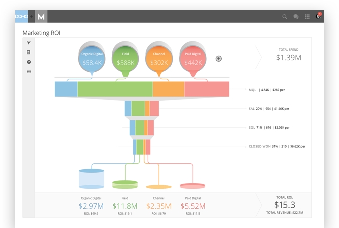
When you choose Domo, you can share dashboards that present real-time data views that your team can simultaneously use. The application also has collaboration tools that allow multiple users to work together to create and analyze reports.
Domo maintains an app store that contains plug-ins and utilities that help users customize the software for their environment.
Zoho Reports
Zoho Reports puts business intelligence at your fingertips using a drag-and-drop interface that makes connecting data sources and creating visualizations an easy process. Small and medium-sized businesses often choose this option because the application offers impressive features at a value price.
The graphical interface presents a list of workspaces in which users can build their visualizations. Extensive self-service online support together with a free three-day consultation means that you can quickly setup Zoho Reports and stay productive.
A limited, two-user version of Zoho Reports can be used free of charge.
Final Thoughts
You can use the above six data visualization tools for your business to take advantage of the huge amount of internal and external data that is available to you. As you learn to combine data sources and graphically display them, you will gain new insights into your operation that will help you solve problems and make better business decisions.
by
Lisa Michaels
in
Management
Thank you for reading this article. May be useful EmoticonEmoticon